CCS3 立体箱子 页面载入动画 home 编辑时间 2022/08/10 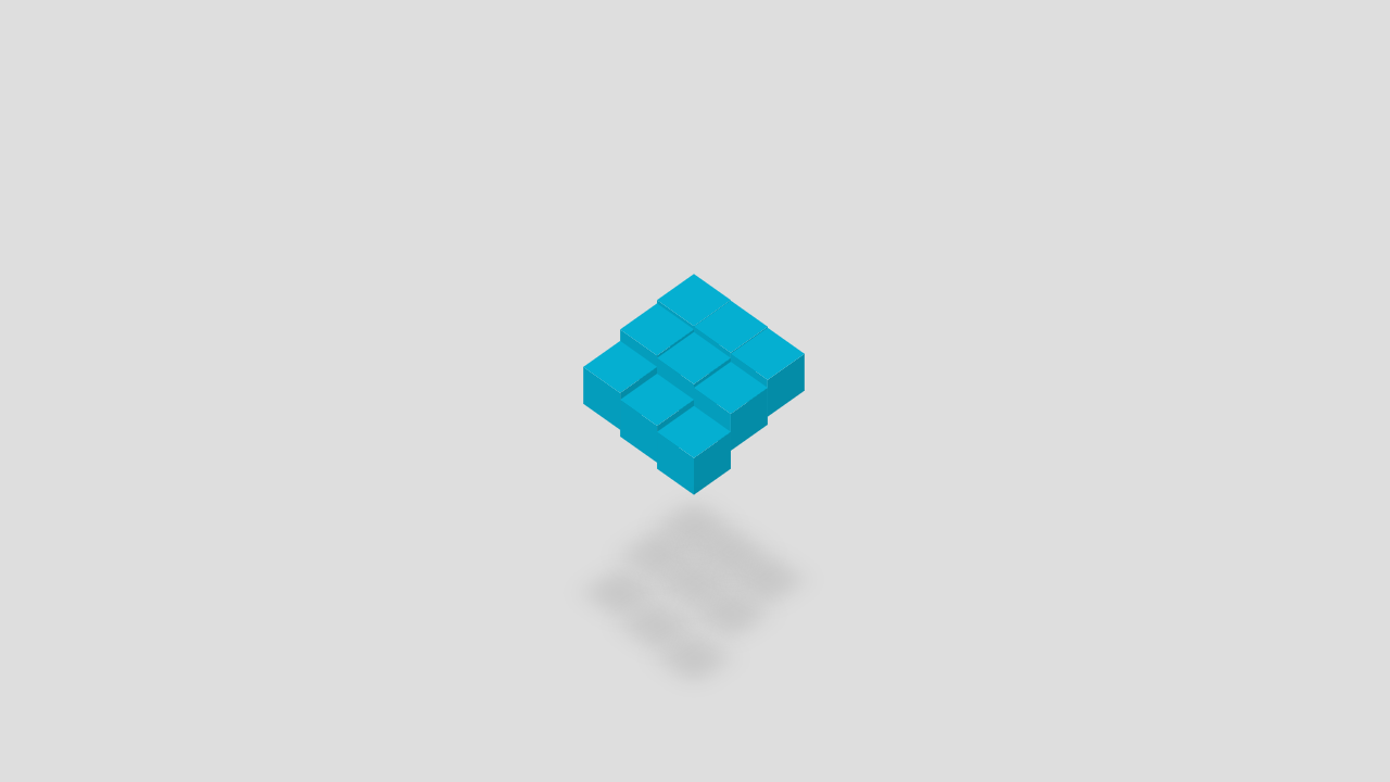 <br><br> ## 前言 <br> 本内容非原创 全部基于这个例子 仅做了适当微调 [https://www.html5tricks.com/demo/css3-3d-cube-loading/index.html](https://www.html5tricks.com/demo/css3-3d-cube-loading/index.html) <br> 之前已经实现过3种加载动画了,链接 [https://zzzmh.cn/single?id=51](https://zzzmh.cn/single?id=51) [https://zzzmh.cn/single?id=53](https://zzzmh.cn/single?id=53) [https://zzzmh.cn/single?id=115](https://zzzmh.cn/single?id=115) <br> 今天是在网上看到这个3D立体箱子效果挺好的,于是再折腾一个新的加载动画效果,顺便用刚学会的requestAnimationFrame做个渐隐动画 [https://www.html5tricks.com/demo/css3-3d-cube-loading/index.html](https://www.html5tricks.com/demo/css3-3d-cube-loading/index.html) <br> **效果图**  <br> 在线源码: [https://gitee.com/tczmh/loading-html-css3-box](https://gitee.com/tczmh/loading-html-css3-box) 线上演示: (模拟3秒后加载完成,动画渐隐) [https://tczmh.gitee.io/loading-html-css3-box](https://tczmh.gitee.io/loading-html-css3-box) <br><br> ## 折腾 <br> `index.html` ```html <!DOCTYPE html> <html lang="zh-CN"> <head> <meta charset="UTF-8"> <title>3D立方体Loading加载动画 - HTML5 CSS3</title> <style> html, body { margin: 0; } /* * 这里有2个方法实现 * 1 是用下面这段 position: fixed; 一般都是用这个,对原来的内容无要求,缺点是IOS系统微信内置浏览器会遮挡方块。。。目测是微信bug,暂时无解 * 2 是用 display: flex; 曲线救国,缺点是width和height必须对其窗口,如果html body有margin,就会顶到屏幕外面,出现滚动条, * 且主页内容会被loading-background顶出屏幕 */ #loading-background { background-color: #dedede; width: 100%; height: 100%; position: fixed; } #loading{ position: absolute; left: 50%; top: 50%; transform: translate(-50%,-50%); } .base { height: 9rem; padding: 3rem; width: 9rem; transform: rotateX(45deg) rotateZ(45deg); transform-style: preserve-3d; } .cube, .cube:after, .cube:before { content: ''; float: left; height: 3rem; position: absolute; width: 3rem; z-index: 99999; } .cube { background-color: #05afd1; position: relative; transform: translateZ(3em); transform-style: preserve-3d; transition: .25s; box-shadow: 13em 13em 1.5em rgba(0, 0, 0, 0.1); animation: anim 1s infinite; } .cube:after { background-color: #049dbc; transform: rotateX(-90deg) translateY(3em); transform-origin: 100% 100%; } .cube:before { background-color: #048ca7; transform: rotateY(90deg) translateX(3em); transform-origin: 100% 0; } .cube:nth-child(1) { animation-delay: 0.05s; } .cube:nth-child(2) { animation-delay: 0.1s; } .cube:nth-child(3) { animation-delay: 0.15s; } .cube:nth-child(4) { animation-delay: 0.2s; } .cube:nth-child(5) { animation-delay: 0.25s; } .cube:nth-child(6) { animation-delay: 0.3s; } .cube:nth-child(7) { animation-delay: 0.35s; } .cube:nth-child(8) { animation-delay: 0.4s; } .cube:nth-child(9) { animation-delay: 0.45s; } @keyframes anim { 50% { transform: translateZ(0.5em); } } </style> </head> <body> <!-- 本内容非原创 全部基于这个例子 仅做了适当微调 https://www.html5tricks.com/demo/css3-3d-cube-loading/index.html --> <div id="loading-background"> <div id="loading"> <div class="base"> <div class="cube"></div> <div class="cube"></div> <div class="cube"></div> <div class="cube"></div> <div class="cube"></div> <div class="cube"></div> <div class="cube"></div> <div class="cube"></div> <div class="cube"></div> </div> </div> </div> <script> const loading = document.querySelector('#loading'); const background = document.querySelector('#loading-background'); let opacity = 100; /** 渐隐动画 每一帧减少1%透明度 1秒60帧 100帧后消失 */ function loadingFadeOut() { if (opacity > 0) { requestAnimationFrame(function () { opacity -= 2; loading.style.opacity = opacity / 100; loadingFadeOut() }); } else { document.body.removeChild(background); } } // 模拟3秒后 执行加载完成 setTimeout(function () { loadingFadeOut(); }, 3000) </script> </body> </html> ``` w 其实没什么好讲的,都在代码和注释里了。 1. style可以加到css文件,放head里 2. div 放在body最前面第一行 3. 页面加载完成后调用 loadingFadeOut 方法 <br> **注意** 有极小概率出现执行不到这行代码 `document.body.removeChild(loading);` 会导致遮罩层永远不消失 保险起见可以额外加一个settimeout 例如10秒后强制隐藏遮罩层 这里就不做演示了 略 ~ <br><br> ## END <br> 在线源码: https://gitee.com/tczmh/loading-html-css3-box 线上演示: (模拟3秒后加载完成,动画渐隐) https://tczmh.gitee.io/loading-html-css3-box 送人玫瑰,手留余香 赞赏 Wechat Pay Alipay Javascript 防抖 节流 控制单位时间内方法执行次数 纯 JavaScript Canvas 实现图片放大预览、多张切换、动画效果等